
CASE
STUDY
Brand Discovery and Identity Creation for a Senior Protection Service
Introduction
A new startup approached us with a mission: to create a service that helps protect seniors from phone scams. The company was still in its early stages and hadn’t yet chosen a name. Their goal was to explore the landscape of similar services and define a brand identity that would resonate with older adults and their families.
Our consultancy was brought in to lead the brand discovery process. This included researching competitors, identifying visual and messaging trends, and ultimately presenting three distinct brand directions to help guide the company’s identity moving forward.
Project Goals and Objectives
The primary objective was to explore how other companies in the senior protection and scam prevention space were positioning themselves, and to use those insights to develop a unique and effective brand identity.
Key goals included:
- Conducting a deep dive into the competitive landscape
- Creating mood boards to visualize industry trends
- Developing three distinct brand identity concepts
- Ensuring each concept was accessible, trustworthy, and appealing to the target demographic
The final deliverables would help the client choose a direction for naming, visual identity, and tone of voice.
Research and Discovery
To begin, we conducted an in-depth analysis of companies offering scam prevention, elder tech support, and senior safety services. We examined their:
- Visual styles: Color palettes, typography, and imagery
- Messaging: Tone of voice, taglines, and calls to action
- Positioning: Whether they leaned more toward tech, care, or security
From this research, we created a series of mood boards that captured the dominant themes in the space. These boards helped identify gaps and opportunities for differentiation and served as a foundation for the brand concepts that followed.
Colour Theory and Strategy
Based on the research and brand exploration, we developed three distinct brand directions, each with its own color strategy, tone, and visual personality.
-
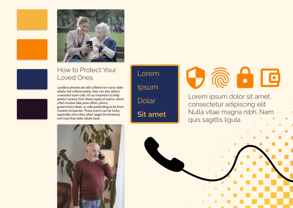
1. Warm and Personable
- Color Palette: Orange: #F4A300, Light Orange: #F7C06B, Dark Blue: #2D3E50, Medium Blue: #3A4E6B, Light Blue: #5C6D82
- Tone: Friendly, approachable, and community-focused
- Visual Style: Rounded typography, warm photography of seniors with caregivers, and inviting layouts
- Purpose: To create a brand that feels emotionally connected and trustworthy, ideal for families seeking a caring and personable solution
-
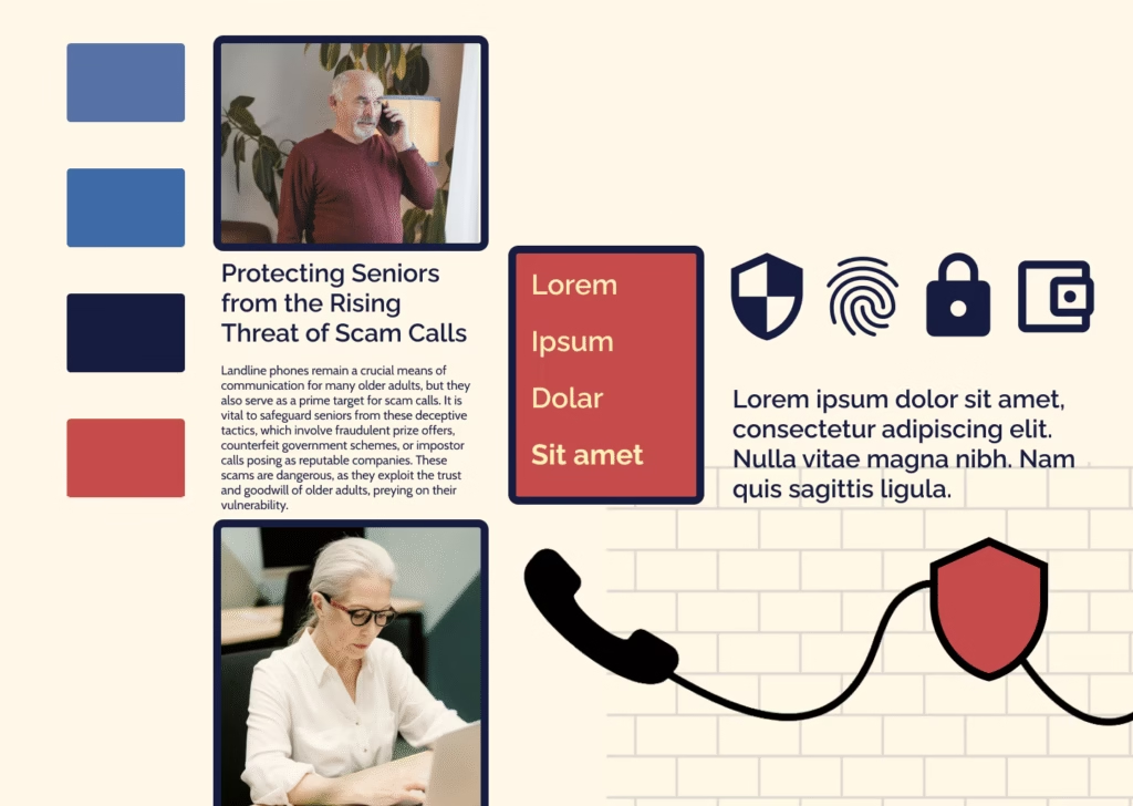
2. Bold and Protective
- Color Palette: Red: #D94F40, Dark Blue: #2D3E50, Medium Blue: #3A4E6B, Light Blue: #5C6D82
- Tone: Assertive, confident, and security-driven
- Visual Style: High-contrast layouts, bold headlines, and imagery that emphasizes vigilance and action
- Purpose: To position the service as a strong and proactive defense against scams, appealing to users who prioritize safety and authority
-
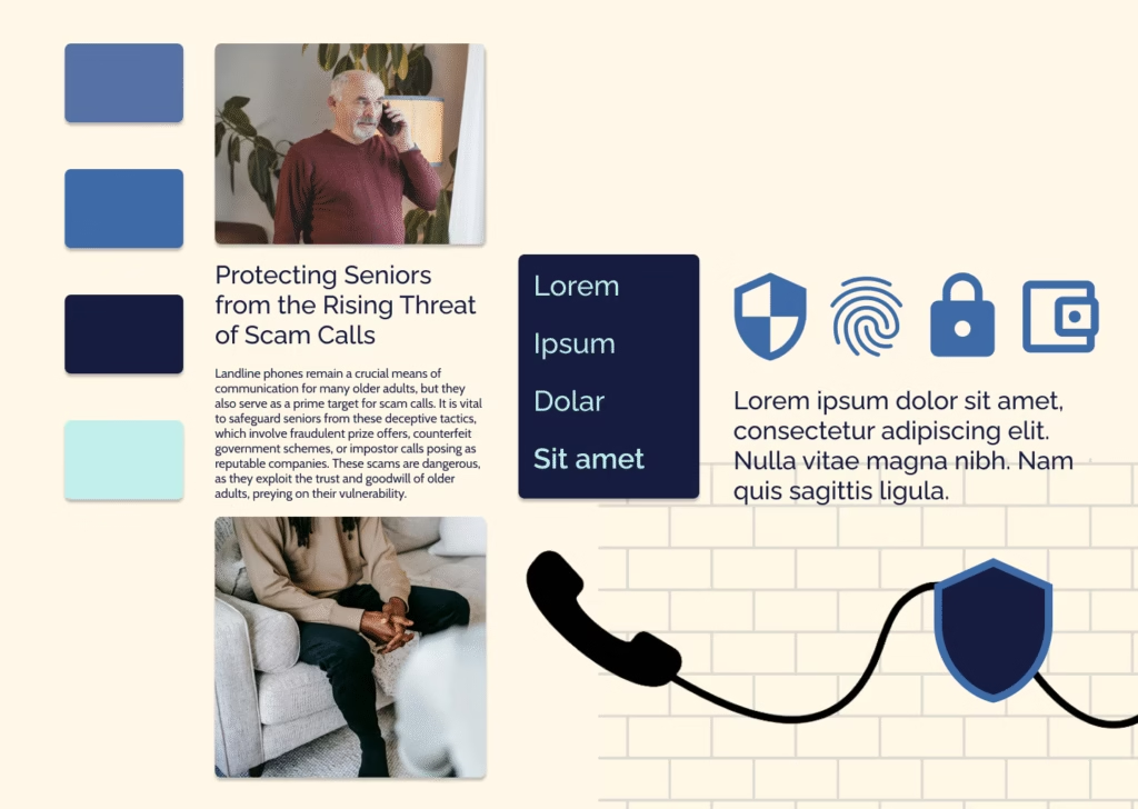
3. Calm and Reassuring
- Color Palette: Navy Blue: #2D3E50, Medium Blue: #3A4E6B, Light Blue: #5C6D82, Soft Blue: #9DC8DA, Cream: #FAF7EF
- Tone: Gentle, professional, and calming
- Visual Style: Clean, minimal layouts with soft imagery and subtle messaging
- Purpose: To offer a sense of calm and clarity, ideal for users who value simplicity, peace of mind, and a reassuring presence
Each palette was designed with accessibility in mind, ensuring sufficient contrast and legibility for older audiences. These color systems helped shape the emotional tone of each brand direction and guided the client’s decision-making during user testing.
Design Process
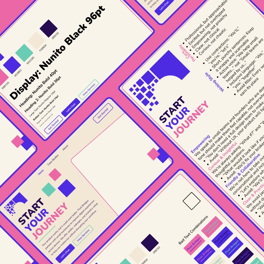
The process began with research and mood board creation, which helped the client visualize the competitive landscape and identify what resonated most with their mission. From there, we developed three brand identity concepts, each including:
- A color palette
- Sample typography
- Imagery and iconography references
- Suggested tone of voice and messaging examples
These were presented in a side-by-side format to help the client compare and contrast the emotional and strategic impact of each direction.
Final Design Solution
As this was a brand discovery engagement, the final deliverables were strategic rather than finalized assets. We delivered:
- A set of mood boards summarizing industry trends
- Three fully developed brand identity directions
- Recommendations for next steps, including naming, logo development, and user testing
The client used these materials to conduct a survey with potential users to evaluate which brand direction resonated most.
Results and Impact
The client tested the three brand directions in a user survey targeting potential customers and their families. The results showed that the third brand direction, the calm and reassuring identity with monotone blues and softer messaging, was overwhelmingly preferred.
This feedback gave the client clear validation and direction. They moved forward with developing their brand based on the third concept, using the visual and tonal foundation established during the discovery phase.
The project provided a strong strategic base for the company’s next steps in naming, visual identity, and product development, ensuring their brand would connect meaningfully with their audience from the start.
Improved
Digital
Experiences
We help small businesses and startups build smarter, more user-friendly digital tools. Whether you’re starting fresh or ready for a redesign, we’ll work with you to make sure your digital presence actually works for the people using it.
Ready To Explore What’s Possible?
Let’s talk about your digital tools, your goals, and how we can help bring them together.
Let’s Chat