
CASE
STUDY
Creating the brand for Pixel Bridges
Introduction
Founded in 2025, Pixel Bridges is a UX consultancy and digital education studio with a mission to make digital learning more engaging and accessible. The founder, Sam, envisioned a brand that would reflect a fun, friendly personality and stand out in a sea of overly professional and conventional websites.
The goal was to create a visual identity that felt approachable and playful while still being functional and accessible. We lead the brand and website design. The development of the live site was later executed by Digital Realm, a local development company.
Project Goals and Objectives
The primary objective was to develop a brand identity that communicated creativity, approachability, and innovation. The design needed to reflect the studio’s focus on digital education while appealing to a broad audience, including educators, learners, and creative professionals.
Key goals included:
- Creating a fun and accessible color palette
- Designing a logo that visually represents the studio’s mission
- Designing a website that feels unique and engaging
- Ensuring all visual elements meet accessibility standards
The brand also needed to be flexible enough to extend across educational materials, social media, and future digital products.
Research and Discovery
To inform the design direction, we explored standout design studios known for their bold and playful branding. One major inspiration was Pink Pony Creative, whose use of vibrant colors and whimsical design elements helped guide the tone for Pixel Bridges.
The research also included analyzing educational platforms and creative agencies to understand how they balance professionalism with personality. The goal was to avoid the sterile, overly corporate look common in the industry and instead embrace a more human-centered, joyful aesthetic.
This exploration helped define a visual language that would be both distinctive and aligned with the studio’s values.
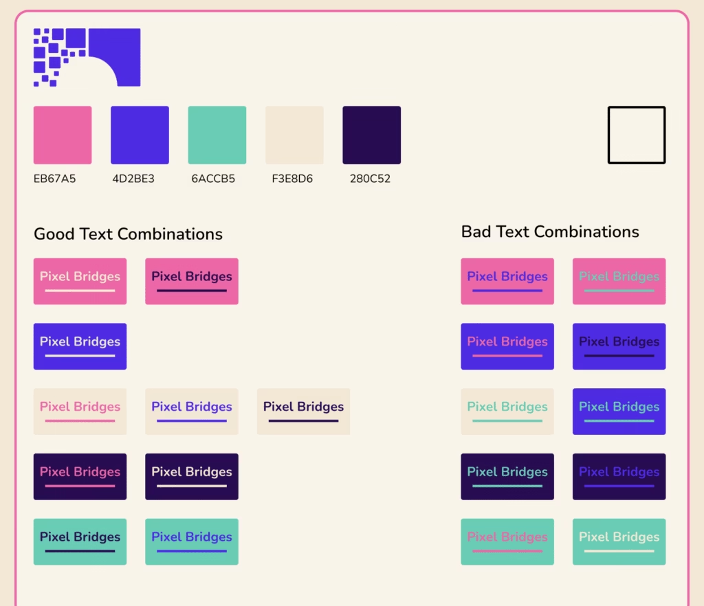
Colour Theory and Strategy
The color palette for Pixel Bridges was designed to be vibrant, playful, and accessible—perfectly aligned with the studio’s mission of making digital education engaging and approachable. The palette includes:
Navy Blue (#0C0A3E): A deep, grounding color used for text and backgrounds, providing strong contrast and supporting accessibility.
Pink (#FF6AD5): A bold, energetic color used for accents, and illustrations. It adds a sense of creativity and fun.
Teal (#00D2FF): A bright, refreshing blue tone used for highlights and interactive elements, bringing clarity and contrast.
Green (#00DCA0): A lively, optimistic color used sparingly to add variety and reinforce the brand’s fresh, forward-thinking identity.
Cream (#FAF7EF): A soft, neutral background that balances the vibrant tones and enhances readability.
Design Process
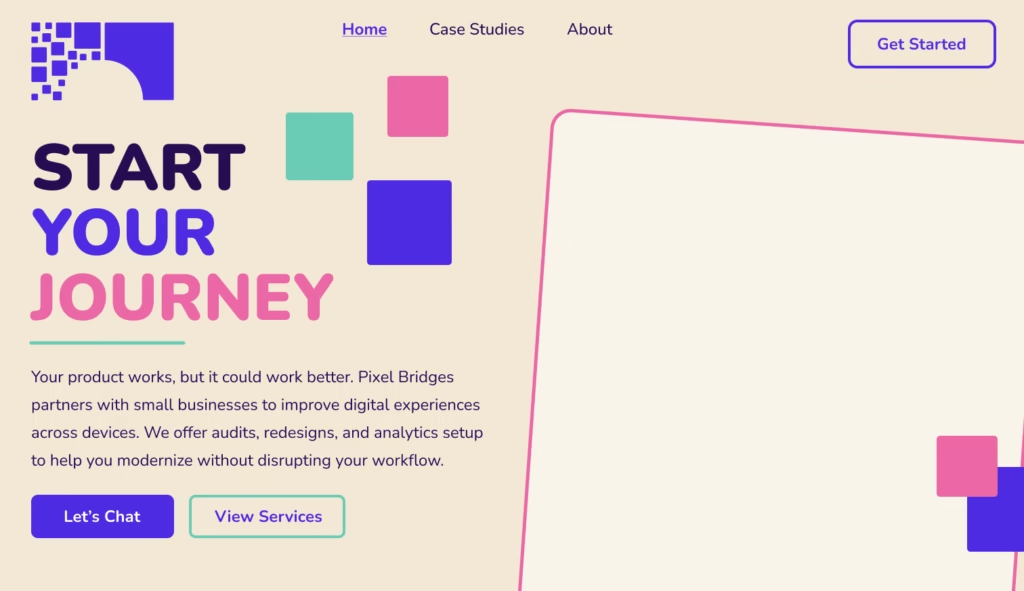
The logo was inspired by children’s wooden building blocks, symbolizing the idea of many small pieces (pixels) coming together to build something greater, a bridge. This metaphor reflects the studio’s mission to connect people through education and design.
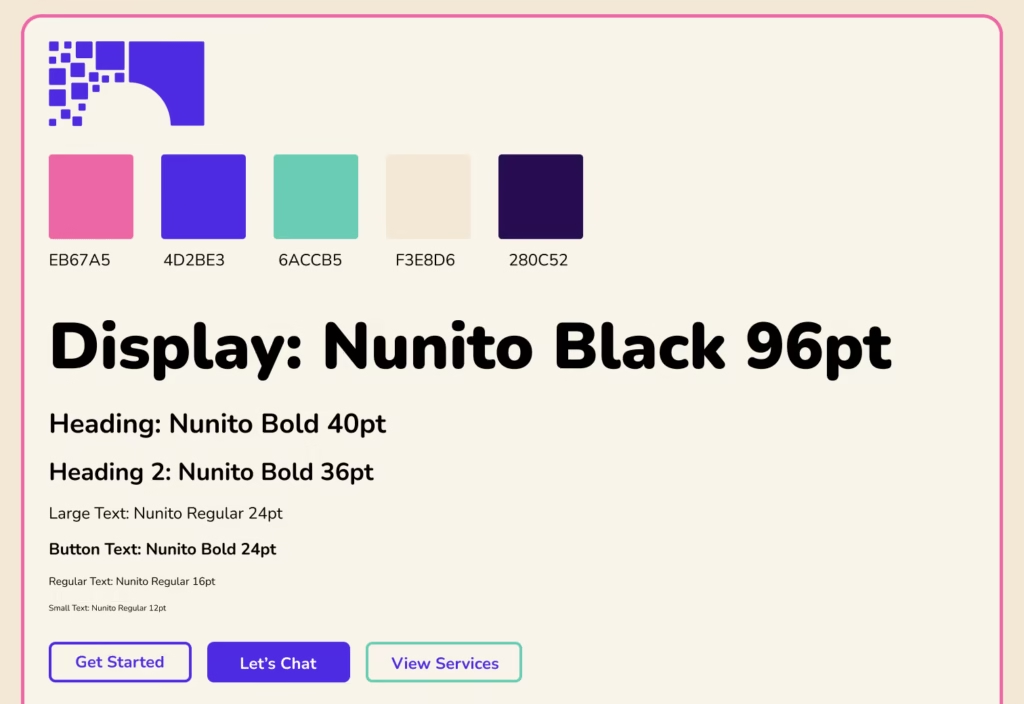
Typography played a key role in the brand’s personality. The type system used Nunito, a rounded sans-serif font that feels friendly and modern:
Body Text: Nunito Regular, 16pt
Display: Nunito Black, 96pt
Headings: Nunito Bold, 40pt and 36pt
Final Design Solution
The final design features a bold, accessible color palette and a playful visual language.
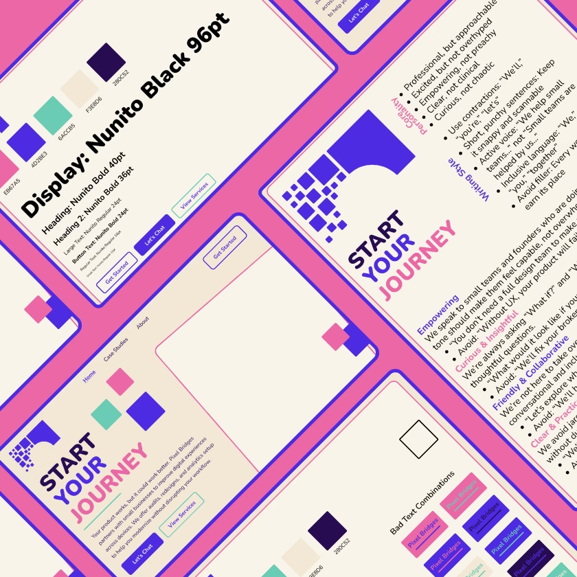
Deliverables included:
- A complete brand board with logo, color palette, and typography
- A responsive website mockup in Figma
- Reusable UI components for future digital products
- Accessibility guidelines for developers
- Tone of voice documentation for consistent messaging
The final website was developed and launched by Digital Realm, who translated the design system into a fully functional, responsive site.
Results and Impact
The new branding and website have positioned Pixel Bridges as a fresh voice in the UX and digital education space. The visual identity stands out while remaining accessible and user-friendly.
The brand system is now being extended to educational content, social media, and future product interfaces, ensuring consistency and recognition across all touchpoints.
This project successfully translated a vision of playful professionalism into a cohesive, scalable design system that supports the studio’s mission of building bridges through digital education.
Improved
Digital
Experiences
We help small businesses and startups build smarter, more user-friendly digital tools. Whether you’re starting fresh or ready for a redesign, we’ll work with you to make sure your digital presence actually works for the people using it.
Ready To Explore What’s Possible?
Let’s talk about your digital tools, your goals, and how we can help bring them together.
Let’s Chat