
CASE
STUDY
Refreshing a Marketing Website: Updating the brand of a 10-year old inventory management company.
Introduction
In 2017, a father-and-son team launched a software solution aimed at improving how warehouse data is stored and integrated with other systems. Their application offers features like reporting and a REST API to connect warehouse management software with broader business systems.
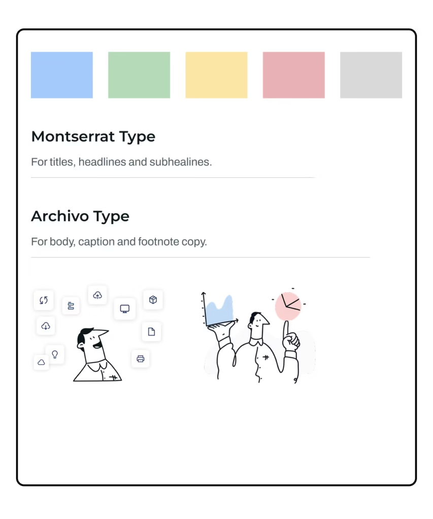
The original brand design featured a palette of blue, green, yellow, and red, with a light and “beachy” aesthetic that didn’t align with the industrial and data-driven nature of inventory management. The site also relied heavily on illustrations, giving it an outdated appearance. As the company sought to modernize its image, we were brought in to lead a brand refresh. The initial scope included updating the color palette and designing a new case studies page within a six-week timeline.
Project Goals and Objectives
The primary goal was to evolve the brand into something more mature and professional, suitable for the warehouse inventory management space. A key requirement was ensuring the new color palette met AAA accessibility standards for web design.
The updated color system needed to be flexible enough for both the corporate website and the software platform. It also had to be developer-friendly, with components that could be easily implemented without requiring significant development time.
Research and Discovery
To guide the redesign, we researched companies with similar integration-heavy platforms. One key reference was a security and compliance platform known for its bold colors and organic design elements, offering a more mature alternative to the original aesthetic.
Another source of inspiration was a project management tool with a darker, bolder style and a clean, readable layout. This helped inform how the new color system could remain accessible while being visually engaging.
A third reference was a productivity platform with a lighter, cleaner branding style. Its integrations page was particularly useful as a model, given the need to clearly present multiple software integrations.
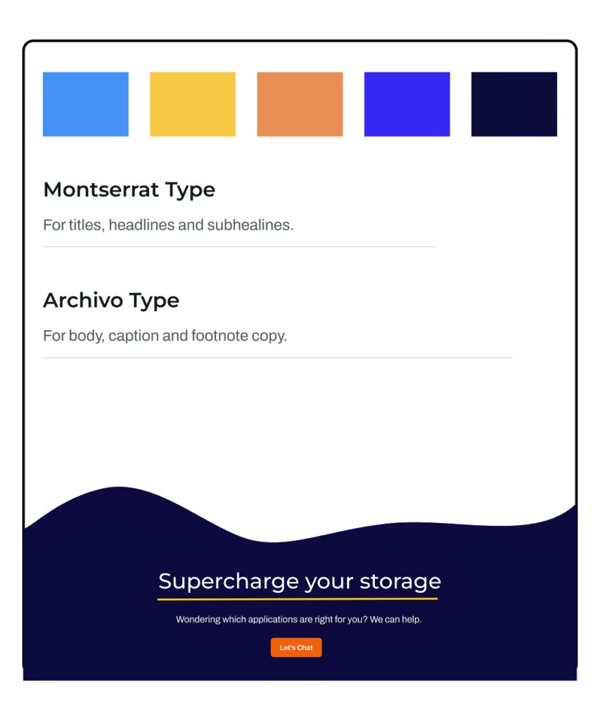
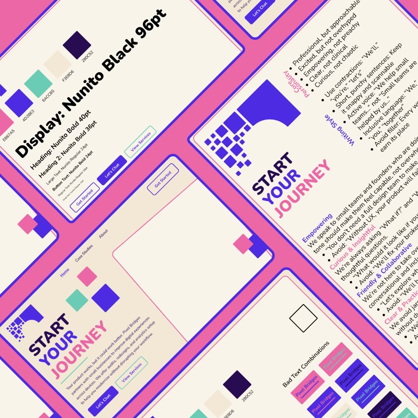
The original brand blue (#2491FF) was retained as a base color, while bold complementary colors were introduced to replace the previous light hues, creating a modern palette aligned with a more professional identity.

Colour Theory and Strategy
The new palette aimed to balance boldness with accessibility. A very dark blue (#0C0A3E) was chosen as a background color to complement the original blue without resorting to black. This provided a strong foundation for contrast.
A bright yellow (#FFC800) was introduced to add vibrancy and contrast, especially effective against the dark background. For headings and calls to action, a bold orange (#F3772B) was selected after testing several shades for accessibility compliance.
These choices created a visually engaging and accessible color system that could be used across both marketing and product interfaces.
Design Process
The new palette was tested in a sample case study layout. While the initial results were more professional, the design still felt flat. To add energy, a vibrant blue (#3F0FFF) was introduced for headings, staying within the monochromatic range but adding contrast.
The yellow worked well as an accent for lines and borders, improving section clarity. The original blue was used for background elements like pull quotes, helping to break up long text sections.
Additional accent colors were tested, including an aqua shade, but were removed due to accessibility concerns.
The process involved iterative testing to ensure the final palette was both visually appealing and compliant with accessibility standards.
Final Design Solution
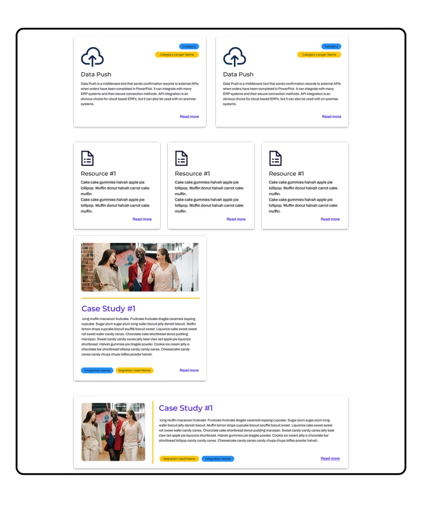
The final solution featured a refined color palette and dynamic visual elements. Wave-shaped SVGs were used to break up horizontal lines in headers and footers, while vertical yellow bars helped highlight content in cards and headers.
Deliverables included a Figma mockup of the case study page, three new card components for future use, and a documented brand color palette for easy developer implementation.
The result was a modern, professional design that balanced boldness with clarity and usability.
Results and Impact
The updated design was handed off to developers for implementation on the website. The color palette will also be extended to include system states like warnings, errors, and success messages within the software platform.
This work established a unified brand identity that can be consistently applied across all marketing and product assets, informed by research and grounded in accessibility best practices.
Improved
Digital
Experiences
We help small businesses and startups build smarter, more user-friendly digital tools. Whether you’re starting fresh or ready for a redesign, we’ll work with you to make sure your digital presence actually works for the people using it.
Ready To Explore What’s Possible?
Let’s talk about your digital tools, your goals, and how we can help bring them together.
Let’s Chat